Tips and Help
Professional printing services in Cambridge
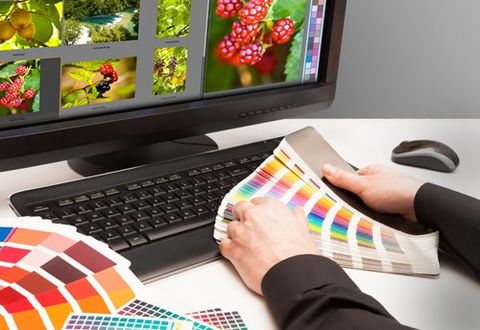
Need help to understand the digital artwork process?
Need to understand a little more about printing services and what might be suitable for your business? Altone Ltd is here with some quick tips for trouble-free desktop publishing. We offer a range of quality printing services that include litho printing, digital printing, large formats, direct mailing solutions
and much more. Based in Cambridge, we serve customers across Cambridgeshire, East Anglia, London and the Midlands. Call us today to discuss your requirements.
Tips to get the right printing service
- General
Supply up-to-date mono or colour laser prints with your files, preferably from a PostScript printer. These can be used to check output for errors. Give clear and precise instructions about quantity, colour, size, folding, binding, proofing and delivery. If in doubt, give Altone a shout!
- Colour
Do not rely on the colours you see on your screen. Most monitors and desktop printers are not accurately calibrated and colours are likely to be misleading. Try to choose spot colours or CMYK tint mixes from sample swatches printed on coated or uncoated paper as appropriate. It is normally sensible to see some sort of colour proof - there are a range of options available to suit different requirements for price and fidelity.
Ensure that all colour images are converted from RGB or Indexed Colour modes to CMYK. Bright RGB colours are likely to look much duller when converted to the nearest printable equivalent.
Ensure that all colours to be printed in CMYK process colour are specifically designated as process separated (note that colours defined with the CMYK model will not automatically be process separated). Otherwise, incorrect spot colour plates will be generated.
Be particularly careful using spot colours and duotones. Ensure that the names of colours in duotone or EPS files are correctly specified and imported into the page layout package. A common mistake is to call a duotone black 'Process Black' or 'Process Blue' rather than 'Black' or 'Cyan' - 'Process Black' will output to a separate plate from the standard 'Black' in a page layout file. Duotones usually need to be saved in EPS format to work. Duotone effects can be simulated by colourising TIFF files in the page layout programs; however, the results are not as controllable as true duotones.
Where spot colour tints are mixed, as in a duotone, ensure that the colours print at different screen angles. By default colours normally all print at 45 degrees, which would cause ugly screen-clash.
- Trapping
Trapping printed colours by creating fractional overlaps is important for producing a good print. Quark XPress has automatic trapping which is generally satisfactory; notable exceptions to look out for are that it automatically sets solid black boxes to 'overprint' (which is not usually desirable where there is variable colour underneath) and that if even a small corner of a text box overlays an imported graphic, coloured text may be trapped as if it also overlays the graphic (this may cause some text to look 'fatter' than it should).
These problems can be solved by customising the trapping. Later versions of PageMaker also have trapping capabilities, although these are disabled by default. Page layout programs will not trap imported vector graphics, but you can apply trapping from within the illustration program; small black text should normally be set to overprint and areas of colour can be trapped using thin overprinting strokes.
- Separations
It is a good idea to print trial separations of colour pages on a PostScript printer. This will pick up most of the separation problems referred to above and may also reveal trapping problems.
- Scanning
Colour or greyscale images should ideally be scanned to a resolution of about 300dpi at the size they are used; 250dpi normally gives acceptable results, but below about 200dpi images will start to look soft and pixelated (although for some uses such as backgrounds or large posters this may not be a great problem).
Although the quality of flatbed scanners has improved significantly, don't expect perfect repro quality colour scans from low or mid-range scanners. Most printers or bureaus will be able to produce hi-end scans for you. With some practice, flatbed scanners normally produce acceptable greyscale scans. For good printed results, restrict greyscale levels to about 3-97 percent so that there are no large areas of pure black or white. Most monitors are unlikely to be calibrated accurately enough to make fine adjustments to scans - if in doubt, measure actual percentage colour values. Almost all colour or greyscale scans will benefit greatly from applying an unsharp mask filter.
Simple black and white images should be scanned in 'lineart' or 'bitmap' mode. Use a high resolution for these - ideally at least 600dpi at the size they are used, higher for images with fine detail.
- Graphic files
Always supply all the original graphic files placed in page layout documents. This should be done even if they are 'embedded' in a program like PageMaker as embedded images are often stored incorrectly and cannot be edited.
Do not re-name linked graphic files once they have been placed. Never re-name or separate the individual parts of a DCS file, or re-name low resolution place-holder files supplied to you.
Use only TIFF or EPS formats for publishing, do not use GIF, JPEG, PICT or other formats. Do not use jpeg compression within EPS files (except DCS). It is advantageous to use compression for lineart/bitmap TIFF files, but with colour or greyscale images compression usually creates unacceptable delays for relatively little space advantage. In Quark Xpress 3.32 or earlier never apply a background of 'none' to a greyscale or colour TIFF file (it's OK for bitmap/lineart) as Xpress is likely to generate ugly jagged edges while attempting to remove the background on the basis of a low resolution preview.
- Fonts
When someone else outputs your files they will need to have the same fonts installed to get the same results. Several manufacturers produce fonts with the same or similar names which look similar but not identical and which are likely to flow differently.
It is possible make fonts look bold or italic on screen simply by pressing a 'bold' or 'italic' button, however if no true bold or italic font is installed the printed results are likely to be ungainly or ineffective and will vary from printer to printer. Always use true bold or italic fonts.
Convert text within EPS illustration files to 'outlines' or 'curves' to ensure that it prints correctly whether the correct font is present or not. This is particularly important for logos that may be widely distributed, but is best practice for most EPS files. Keep the original version in case you need to edit the file later.
- Layout: bleed, margins and folding
Always add bleed to images that run off the edge of a page. The 3mm standard should be strictly observed for books or booklets because the actual finished size of pages can vary significantly (the inner pages of a saddle stitched booklet can be several millimetres narrower than the cover). For posters, leaflets or stationery, slightly less will normally be adequate.
Allow adequate margins. Very narrow margins look cramped and may even lead to text being trimmed off, particularly on booklets. Narrow borders (less than 4-5mm) may look uneven on a finished sheet if there is even slight variance in trimming.
The dynamics of manipulating paper at high speed mean that folds that seem possible in theory are not always practical on mechanical folders - you don't want to end up with 10,000 leaflets that can only be folded by hand. With many multi-panel folds it is necessary for some panels to be slightly narrower or wider than others - documents should be constructed to take account of this. Don't forget to spell-check and proofread!
Need to learn more about our printing services? Call us today on
Contact Us
ADDRESS
Altone Ltd
Unit 3, South Cambridge Business Park, Babraham Rd, Sawston, Cambridge,
CB22 3JH
OPENING HOURS
Mon - Thurs: 9:00am - 5:00pm
Friday: 9:00am - 3:00pm
Sat - Sun: Closed

© 2024. The content on this website is owned by us and our licensors. Do not copy any content (including images) without our consent.